So You Think You Know Color?
So You Think You Know Color?
Most everyone has strong opinions about color, but does anybody really understand it? Probably not, say the brains behind “Saturated: The Allure and Science of Color,” which runs through January 13 at Cooper Hewitt, Smithsonian Design Museum.
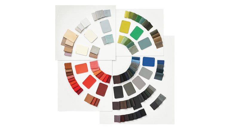
And theirs is an educated view. Jennifer Cohlman Bracchi, a Smithsonian librarian, and Susan Brown, a textile curator for the museum, have studied color for years, preparing for the show. “Saturated” includes more than 60 excerpts of texts on color from Smithsonian libraries, dating to the 1600s, along with almost 200 objects from the permanent collection that illustrate key color concepts.
Color is central to the human experience, from the science of perception to the economics of product design; it’s as fascinating a phenomenon as it is ubiquitous. But what really comes across in a conversation with Brown and Cohlman Bracchi is how mysterious it is. Color has captivated big thinkers such as Newton, Goethe, and Josef Albers. And, ultimately, it has confounded them.
“Saturated” is Cohlman Bracchi’s second exhibition on color theory. After years working with seminal texts on color, she’s more aware of what she doesn’t understand than what she does. I asked her and Brown to share their insights.
The show includes dozens of texts on color theory. Are there big differences between what one theorist says compared with another theorist?
Jennifer Cohlman Bracchi: The differences come from the sort of problems they were trying to solve and their approach to color theory. Some of them were naturalists who were studying, say, insects or birds, and color is used as a main identifier. A lot of the earliest color standards come from naturalists who were trying to standardize a way to communicate with one another about the colors they were seeing in nature.
There are also chemists who were addressing different printing challenges and how colors mix and how different printing processes can achieve a variety of colors by just using maybe three or four colors of ink.
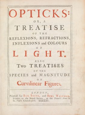
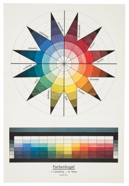
And then you have great scientific minds, like Newton with his book Opticks. In addition to his many other achievements, he devised the first scientific color wheel while studying the principles of light.
The backgrounds of the authors and the theorists in the show are quite varied; many of these people were specialists in an area entirely different from color, and color became almost this side project that they became obsessed with and dedicated much of their lives to.
So color theory aims to help people share understanding of the colors they’re perceiving.
JCB: Yes, standards are developed as communication tools. I read research recently about the color of a tennis ball. Half the people say it’s green, half the people say it’s yellow, and then there’s a small percentage who say something totally different. It’s fascinating how we interpret color. A color sample is not enough. You need language, like a word or some sort of coding, to go with that.
Susan Brown: Some colors are social signifiers; in our culture, the stop sign is red – the ultimate red. If someone asks you to define red, you might think of a stop sign or a fire truck. Whereas a color like purple has no clear point of reference, even in an informal social context. You get a lot more variety if you ask people for the truest purple or the purplest purple.
You’re saying that some colors have become institutionalized and are easier to discuss.
SB: Yes.
Do you have the sense, having looked at four centuries of texts about it, that color is just very hard to describe and to model?
JCB: Yes, it’s still challenging today. Unlike the study of form, which has been rooted in the science of geometry for thousands of years, the exploration of color has largely been speculative. So while something like Euclidean geometry is still valid today, color remains elusive, and there’s really no universal color model that we all use.
Do you think it matters that there’s no universal model?
JCB: The exploration of color is fascinating because there are so many different ways to approach it. But it’s a little hard to encapsulate how complex it can be, and general trends in education stick to standard color wheels and don’t address other scientific discoveries.
Because teachers want to avoid confusing people with color principles that haven’t been settled?
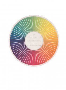
SB: Yes. Newton’s initial leap to take the full spectrum and join the two ends and make the color wheel was so powerful and so useful; people really understand it. It has great functionality. But it leaves out so much information. Every other theorist after Newton was struggling against it, making hemispheres and spheres and cones and ellipses and trying to wedge everything that we do know about color into a basic model. The color wheel is super-useful, but it doesn’t quite accommodate all that is known today about color.
What does it leave out?
JCB: Newton was dealing with the principles of light. So right away, his publication sparked controversy in the art world, because he really wasn’t speaking the language that artists understood, in terms of the mixing of pigments. It wasn’t until 100 years later that Goethe’s work, his theory of colors, resonated with artists because he spoke to the subjective nature of color, explaining that it’s not simply a scientific measurement; it’s much more than that. And then you build from there, where scientific principles have to be balanced with our sense of perception. That can be a challenge to scientifically pin down, because we do all see things differently.
SB: And on a practical level, you see several other theorists after Newton trying to address values, for instance. Newton’s model dealt with the purest saturation of each color. Things like saturation and value and other things that we might use on a day-to-day basis in Photoshop now are not really addressed in the Newtonian model.
Who is working today who wants to advance the theory of color? Who wants to round out the color wheel, so to speak, and make it a fuller explanation?
JCB: I see advancements in examples like Hella Jongerius’ approach, where she argues for the instability of color. She points out how corporations and manufacturers have been trying to pin down color, so it’s stable and it doesn’t change, and it looks the same way in this light versus that light. But really, that’s going against many of the values that color can reveal and how it can change, depending on the lighting of a room or the effects of other objects around it. The systemization of color and the standardization of color have sort of closed our minds to the different ways color can be expressed.
As you did this research, what sort of discoveries did you make?
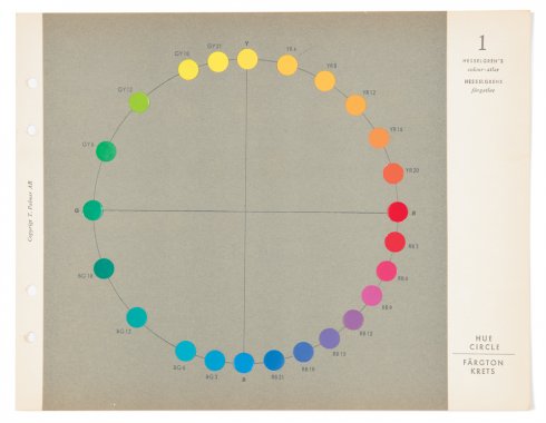
SB:One of the things that was surprising to me was [Sven] Hesselgren’s theory, in that he included green as a primary color – and if we accept the definition of “primary” as meaning that you can’t mix it from other colors, we know that we create green from blue and yellow. Yet he’s a very important theorist, and he included green as one of his primaries. And he also spaced colors differently on the color wheel to reflect the fact that we have greater acuity for certain colors, which is to say, we can distinguish more reds than we can greens. That just speaks to the power of the traditional color wheel; it would never have occurred to me not to give each color an equal slice of the pie.
JCB: One thing I was surprised by was that these contributors to color theory come to it from such a variety of angles. Many are real experts, even a Nobel Prize winner, in other fields but then dedicate the last 30 years of their lives to the study of color. It was interesting to see that it’s this ubiquitous thing in our lives that nobody really sets out to study. It seems like people stumble upon it, and –
SB: And become obsessed.
JCB: And become obsessed.
SB: Even Goethe, who’s such a famous philosopher, considered his theory of colors to be his most important work.
I’m guessing that the discovery in the 19th century that colors could be synthesized in a lab was a big moment. Can you describe that?
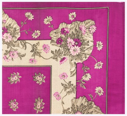
JCB: Synthetic color production was discovered inadvertently in 1856 by William Henry Perkin, who was a chemist. He was 17 or 18 years old at the time. He had an accident in the lab – he had been working with coal tar, trying to synthesize quinine, a cure for malaria. His experiment failed but left behind an oily residue that stained silk a brilliant purple. He called the color mauveine and quickly realized it could be manufactured as a dye. He was the first to manufacture synthetic dyes.
What cultural changes flowed from that?
JCB: Well, from a cultural perspective, bringing chemistry into the industrial world was huge. Before that, chemistry was really more of an academic, intellectual pursuit, so applying it in that way led to so many other things, like medicines and explosives and plastics.
Also, the topic of color harmony became quite prevalent. With the proliferation of color, people had new access to all sorts of colors like never before, and the general rule book of what were acceptable combinations of color went out the window. And in reaction, there was much discussion of color harmony and what color combinations were appropriate and tasteful, and which were not. For instance, wearing some bright colors could even be seen as a sign of mental illness.
That makes me think of Van Gogh and Café Terrace at Night.
JCB: His use of color, I’m sure, was disturbing to some.
Are you saying that, before synthetic colors, there was a folkloric understanding of what color combinations were appropriate, and that got upended?
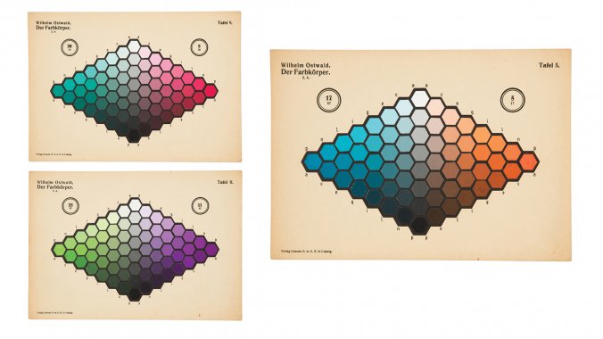
JCB: Yeah, you had certain tastemakers promoting certain color combinations and what looks good together. But after the invention of synthetic dyes, in the literature there is so much dedicated to color harmony, to the point where even somebody like Wilhelm Ostwald, who won a Nobel Prize in chemistry, devoted the last 20 years of his life to trying to figure out the science behind color harmony.
SB: Standardization is the other huge, transformative thing. Before that, it was impossible. Natural dyes, for example, are agricultural products, and each year’s harvest varies in potency. The notion that you could guarantee a particular color transformed so many industries and caused the rise of other industries, like Pantone and other color standardization companies.
What does a color scientist do?
JCB: We’ve met with people from different large global manufacturing industries, and they have teams of people dedicated to color, and they’re looking at color reflectance data and making sure a zipper that’s produced in China will match the cotton that’s being dyed in India. And there are lots of new digital tools that are being applied to that manufacturing world. And yet, there are still many who do their work with their eyes and physical color-sample chips. People deal with color science in many ways.
SB: And with such interesting job titles that we decided to do a feature on the museum’s blog about different careers in color. “Exploratory colorist,” for example – this is somebody’s title.
Every year, we hear that a certain shade of orange – or whatever – is the color of the moment. Who decides that, how do they decide, and do you think those sorts of declarations really shape what people do and buy?
SB: So I think the “color of the year” idea is really more of a marketing tool for big companies like Pantone and Benjamin Moore and a couple of others; it doesn’t have a big impact on most people. But designers do use color trend forecasting tools. They use them as a tool and not as gospel, as jumping-off points. It does influence what ends up on the shelves in the store. Color forecasters analyze trends in many different fields, from fashion and contemporary art to geopolitics and pop culture, to try to anticipate emerging attitudes.
There are certain products closely identified with a color; the 1959 pink princess phone, for example, in the show. You mentioned the red stop sign. Are there other products or objects you can point to where the color is just essential to what the object means or does?
SB: Well, for New Yorkers, of course, it’s the yellow taxi cab. There’s the school bus. In terms of the show, for me, the Verner Panton Heart Cone Chair should be red. You can buy it in other colors, but it should be red. Red looks right.
JCB: Colors, for me, tend to be more representative of the time they came from. I grew up with an avocado-green fridge, which seems unthinkable today. But it’s harder for me to identify what colors I’ll respond to 20 years from now with “Oh, that’s so 2018.”
Do you have ideas about what artists should absolutely understand about color, having worked on this show?
JCB: I’ve read some opinions about color education today and how it seems to be less inclined to include some of the more modern color theories – say, those developed by Albert Munsell or the CIELAB, which is really a combination of our visual perception with scientific measurements. I wonder, if artists were provided with these additional color tools and approaches early in their education, how it might impact their work.
How might it affect there work?
JCB: Their whole outlook on color combinations and just their approach to color may be quite different.
What are you taking away from your work on this show?
JCB: So having researched this for a number of years now, I truly feel that the more I learn about color, the less I know, and that I could spend the rest of my life researching this topic and still barely scrape the surface.
Wow.
JCB: And I’m at a loss to name another topic I could say that about. Also, maybe I’ve become one of those people obsessed with color.
Wow.
JCB: It’s an endless world of fascination.
What else?
SB: There’s still a lot of craftsmanship involved in achieving great colors. There’s a false promise in standardization, that all you need to do is specify the right Pantone number and you’re set. But when you see these objects in person – when you come here to the museum in person and actually look at them – it becomes very clear that these are not order-by-number colors. We spent a lot of time on-press with a very skilled printer to get these really luscious, vibrant, clear colors. There’s still a great deal of skill involved to make things of the highest quality.
So it must be asked: What is your favorite color, and has it changed since you began working on this show?
JCB: I’ll share the title of Hella Jongerius’ recent book: I Don’t Have a Favourite Colour. To me, it’s an impossible choice. Are we talking clothing? Are we talking setting? There are too many factors to choose just one.
SB: I would have to agree with that. As a child, I always said, “My favorite color is blue.” And I do prefer blue for clothing, but I don’t like blue in an interior. So it’s totally dependent on what the end use is.
Your Apple Is Not RED
It’s natural to assume that color is intrinsic to an object. But no, Mark Fairchild, professor at the Rochester Institute of Technology says, color is not that simple. It’s a combination of the object, the light that falls on it, and the perception of the observer. The redness we see in an apple takes place in our brains, he says. And in dim light, that apple will be gray.
There is consensus among scientists who study color that it’s a phenomenon of visual perception; there’s no color without a viewer seeing an object and making sense of it. Yet there is much about color that is not understood – where it is processed in the brain, for example, and precisely how. Experiments with macaque monkeys, who see as humans do, have not found neural channels devoted to color. So far, the way the brain understands color has proven too sophisticated for science to replicate, measure, and model.
How many colors can people see? That answer is also murky. University of Pennsylvania color scientist David Brainard estimates the number is somewhere between a thousand and 100 million. Give or take.
Well, are we all at least having the same subjective experience of yellow or teal or mauve? At this point, Brainard says, nobody knows.
Sources: NPR, New Republic


