

My Favorite Illusion
My Favorite Illusion
My Favorite Illusion

Interior designer Agnes Bourne uses color liberally and strategically throughout her home and in the homes of her clients.
Audrey Hall“In kindergarten, one learns to love and use colors,” designer Verner Panton wrote; “later on, at school and in life, one learns something called taste. For most people this means limiting their use of colors.” I’m not sure where Panton stood, but I come down squarely on the side of the kindergartners.
I love color. No, I’m wild about it. For me, color represents unmitigated joy, passion, energy, and wonder. It’s a fabulous dessert you can’t – and shouldn’t – resist. It’s one of the best parts of life. And I don’t really understand people who are cautious about color, limiting themselves to neutrals in their homes and fretting about what goes with what. I can’t imagine being tasteful and sparing with color when you can swim in it, taking big gulps of fuchsia, coral, seafoam, and midnight blue. Being wary of color is a weird sort of self-denial, like restricting your breathing or your laughter, like swearing off chocolate for life, like wearing orthopedic shoes with a cocktail dress.
Of course, I loved working on this issue devoted to color. I applauded interior designer Agnes Bourne’s bold use of turquoise in her great room and lipstick red in her office. I admired Bart Niswonger for his refusal to confine him self to wood tones in his furniture. “I got so tired of looking at furniture,” he told associate editor Robert O’Connell, “and it’s all either cherry or maple.” Amen.
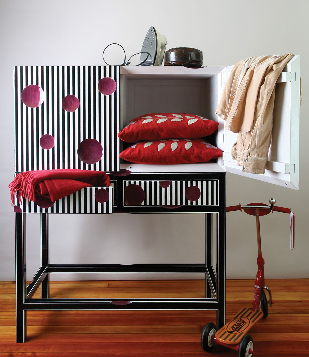
Bart Niswonger’s Striped Cabinet on Stand, a collaboration with Carl Schlerman, exemplifies his enthusiasm for color. Photo: Bart Niswonger
Obviously, I’ve got strong views. And having dabbled in many art forms over the years, I like to think I know color. At the same time, I recognize that my knowledge of color is what German philosophers have called kennen – it’s based on my personal, practical experience.
There’s another kind of knowledge – a truth that hit me like a ton of cerulean bricks when I interviewed the curators of “Saturated: The Allure and Science of Color” at the Cooper Hewitt museum. Wissen is the German term for the knowledge accumulated in a field of study, where personal attachment is not a factor; Susan Brown and Jennifer Cohlman Bracchi immersed themselves in the wissen of color for several years as they worked on the exhibition. Talking with them, I discovered how little is certain about the phenomenon of color – despite centuries of study by great minds such as Newton, Goethe, and Josef Albers.
As Brown and Cohlman Bracchi reminded me, our experience of jeans as blue and stop signs as red is rooted in our minds, not really in the objects we’re seeing; color is more of a belief than a fact. What’s more, scientists don’t fully understand what happens in the brain to convince us we’re seeing an orange flower or green grass. And they don’t know if the “grass-green” in my head is the same color you see – or think you see.
“Color is an illusion, but not an unfounded illusion,” C.L. Hardin wrote in his 1988 book Color for Philosophers. Learning just how illusory color is means discovering that my firmly held convictions have little basis in fact. It’s like learning that one of my dramatic formative experiences happened in a dream or that a beloved hero is actually a figment of my imagination. I’m a little less cocky now. I’m no longer sure I know color.
I still love it. But now I know that others may see color differently from me because they actually see colors differently. Color is mysterious, which – for me at least – only makes it more fascinating.

